Measuring Web Performance
Some time ago we announced that Allegro passes Core Web Vitals assessment and thanks to that we were awarded in “Core Web Vitals Hall of Fame”. It means that Allegro is in the group of the 27% fastest websites in Polish Internet.
In this series of articles, Webperf team and I want to tell you what our daily work has been like over the years, what we’ve optimized and what we’ve failed at, and how the perception of web performance has changed at our company.
Our path to a quite fast page (we’re still hoping for more) was winding, bumpy, more than once ended in a dead end and forced us to rethink our solutions.
We want to show that there is no magical { perf: true } option and that some things you just have to figure out by trial and error.
Beginnings #
It all started with a group of enthusiasts concerned about the poor performance of Allegro and the lack of actions to improve it. Their grassroots initiative was appreciated and the core of the technical team (Webperf) was formed. There was one major problem — it is relatively easy to make micro-optimizations in the code of one component, however, it is much more difficult to push through a major change involving different teams or business areas. The company needed to know how the change would affect not only performance but also the business. At that time there were many success stories from various companies on the internet about how improvements in loading speed had impacted their business results. However, at Allegro, we had never seen correlation between performance and business. It was our holy grail to be found and as a first step, the decision was made to collect performance measures that could be linked to business data in the future.
Measurement #
The idea was simple, we wanted to:
- create a library which would use Performance API to create marks on the client side,
- use an existing mechanism for sending events to the backend,
- store the information in a database so we could easily operate on it,
- and finally display basic metrics on a dashboard.
But first things first.
Metrics Library #
The first commits to the library collecting performance measures (called Pinter) took place on June 5, 2017. Since then, it has been actively developed.
We collect two types of measures in Pinter:
- Standard, e.g., Web Vitals,
- Custom, e.g., Time To Component Interactive.
Principle of operation of the Pinter #
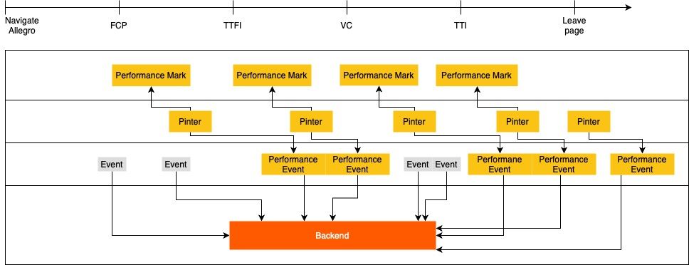
In general, metrics’ changes are tracked using PerformanceObserver from which values are collected, processed into a performance event and sent to the backend.
However, there are several metrics, e.g., Navigation Timing, Resource Timing or Benchmark that are only sent once, after the document has loaded.
Our script, like any other, can affect web performance. This is why the traffic is sampled and the library itself is not served to all users.
Collected measures #
The browser provides a whole bunch of APIs to analyze resources, connections etc. Combined with data from the DOM tree, we have a general picture of what the user experience was like.
Below is a slice of what we are collecting and why:
- Web Vitals
- First Contentful Paint — when the first content on the page was rendered.
- Largest Contentful Paint — what is the largest image or text block on the page and when it appeared on the screen.
- Cumulative Layout Shift — layout stability.
- First Input Delay — how quickly the first user interaction is handled.
- Custom Marks
- Time To Component Interactive — when the critical component is fully interactive and can handle all user actions, e.g. after React rehydration.
- Navigation
- Type — what type of navigation the user was using. Useful when analyzing metrics.
- Timing — data from
window.performance.timingabout connection, response time, load time etc.
- Resources
- Transfer Size — the total size of scripts and styles transferred over the network.
- Total Encoded Body Size — the total size of scripts and styles on the page. Is not distorted by cache.
- Resource count — number of assets with breakdown into styles, internal scripts and 3rd party scripts.
- Benchmark — information about the performance of a given device. We want to know if weaker devices perform worse and if our fixes have a positive impact on them.
The backend #
All collected performance data is sent to the backend where it is anonymized, aggregated and prepared to be displayed on charts. It is a complex system which allows us to operate only on the necessary portion of data.
Principle of operation of the backend #
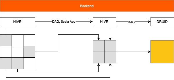
Initially, all events (including performance ones) are gathered and stored in a single HIVE table. We want to be able to quickly analyze as well as compare historical records, but this amount of data would effectively prevent us from doing so. Therefore, we need a whole process to extract the most relevant information. We transform the filtered performance events combined with more general data (page route, device details etc.) to a new, smaller Hive table. Then we index this data in Druid (high performance real-time analytics database), which is consumed by Turnilo and Grafana. Once the entire process is complete, we are able to filter, split, plot and generally process about 2TB of data in real time as needed.
Visualizations #
We use two independent systems to present the data:
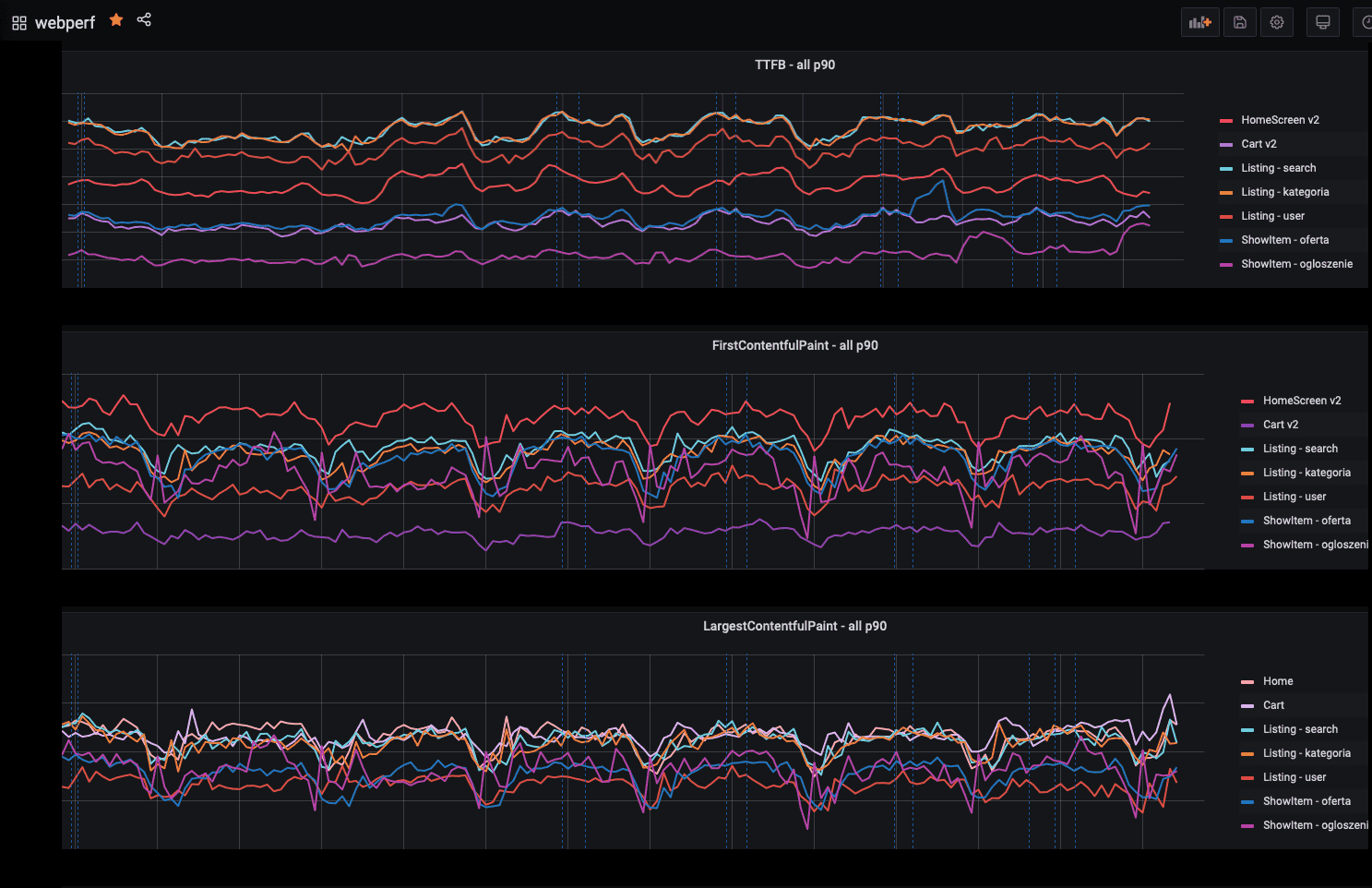
- Grafana, which is used for daily monitoring.
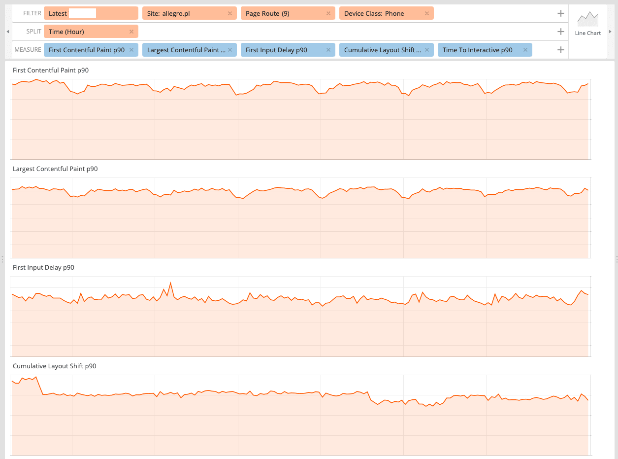
- Turnilo, which is used for analyzing anomalies or testing the impact of A/B experiments.
Grafana #
Our dashboard gathers the most important metrics which allow us to catch potential performance problems but it is not used for analysis. It is worth noting that we display data only for mobile devices. We do this for a reason: in general those devices are not as efficient as desktops and the share of phones in Allegro traffic is growing day by day. We assume that improving performance on mobile devices would have a positive impact on desktops as well.
Turnilo #
It is a business intelligence, data exploration and visualization web application. Thanks to the wide range of available dimensions and metrics we are able to pinpoint found issues to particular pages, device types or even browser versions and then check if the applied solution actually worked.
Monitoring #
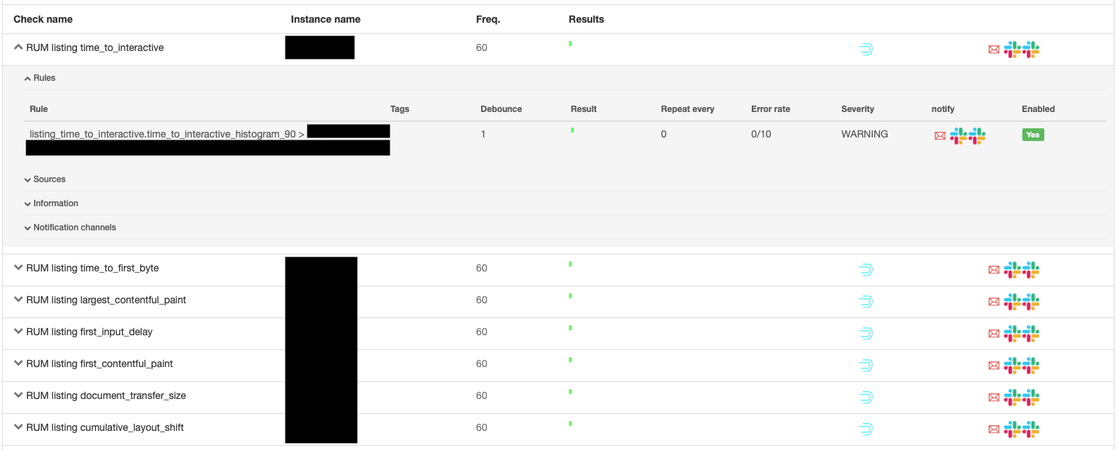
Checking measures on the dashboard is our daily routine, but we are only humans and sometimes we can miss certain anomalies or we won’t be able to notice a changing trend so we decided to automate our work as much as possible. We have created a range of detectors that notify us on Slack or mail when a predetermined threshold is exceeded.
Summary #
Before we started our optimization work, we needed to know:
- What do we want to measure?
- How will we collect this data?
- How will we visualize and compare them?
Answers to those questions and implementation of their results allow us to keep track of performance regression from our users. We are able to analyze how the implemented optimizations, A/B tests or content changes affect performance metrics.
In the next article, we will tell you what we were able to optimize, how our metrics changed over the years and what were the failures from which we have learned a lot.
