

Turnilo — let’s change the way people explore Big Data
Two years ago at Allegro we used to have a very typical Big Data technology stack. The architecture was based on a Hadoop cluster and we would query it with plain Hive queries, Spark jobs and Jupyter notebooks. Over those last two years we have transformed it into a more efficient and easy to use OLAP platform.
State of the art when it comes to OLAP in Big Data #
Having a setup like the one described above required a lot of technical knowledge and thus was not really user friendly. Analysts who were familiar with SQL but also less familiar with programming had to write SQL-like queries: HQL for Hive, almost SQL for Spark etc. Both preparing and running those queries to get the expected results were time consuming tasks which actually prevented iterative data exploration. We had sped up the queries by introducing Presto but still there was a lot of mundane work to be done in order to answer typical business questions like: “What are the top 100 bestsellers in books category this week”.
There was an another issue — we were living in a world defined by batches. Although we had a lot of real-time clickstream passing our Kafka cluster and microservices events in Hermes they were accessible only to developers and required implementing custom applications. This meant that users could not access insights about ongoing experiments as the data was not in the place accessible to them yet for another hour or even day in some cases. Being one of the biggest e-commerce platforms in Europe we needed near real-time universal data access to verify the state of our business.
What was even worse — business people who were not familiar with SQL could not make any ad-hoc analysis with either batch or real-time data. They had to rely on reports prepared by analysts’ teams using BI tools with already predefined dashboards which were not flexible enough. We came to the conclusion that we should try a more modern approach. Apache Druid came to the rescue.
Apache Druid is an online analytical processing (OLAP) software. It enables both real-time and batch data ingestion into data cubes with predefined dimensions and measures. It is a distributed, highly scalable platform making sub-second queries possible thanks to using: column-oriented storage, native search indexes, approximate algorithms, flexible schemas and time-optimized partitioning. Queries are an order of magnitude faster in comparison to Hive, Spark SQL, Presto and even BigQuery. It may sound fantastic but there is really no hidden magic here. Besides the well designed architecture of Druid this level of performance is achieved by rolling up the data during ingestion process which typically leads to 10 — 100x fewer rows. This opened the possibilities for creating a truly interactive UI allowing users to stay focused while exploring the data.
Intuitive UI is always a game changer for business users #
At the time we were installing the Druid cluster we found out that there existed two web based applications that could make use of it: AirBnB’s SuperSet and Imply’s Pivot. We installed both of them and immediately discovered what use cases each of them supported best. SuperSet presented itself as a great tool for data visualization with dashboards predefined by analysts. Unfortunately, it was not that good when it came to slicing, dicing and drilling through the data. Pivot on the other hand was much better in the area of data exploration. Thanks to these two complementary UIs we were able to fulfill a broad range of data access needs within our company. Business users could either skim through prepared reports or literally immerse in data by simply clicking around available data cubes.
Pivot license transition #
We were really happy at Allegro being able to use both Imply Pivot and AirBnB SuperSet under the terms of an Open Source Apache License. We believe in transparency and community which can drive growth of software and its features. It is also essential for us that we can debug the software when needed, analyze how the code was written in order to improve it or to squash the bugs which are inevitable in every piece of software. Unfortunately, Pivot is no longer an open source tool since November 2016 when it was announced on the mailing list that a GitHub repository of Pivot had been closed. As Pivot has become commercial software we naturally decided to pay for the license granting us rights to use it. We had quite good support coming from Imply and we would like to thank Vadim Ogievetsky who has been a main Pivot committer and is now a Chief of Product at Imply. We believe that our cooperation was mutually beneficial. We provided insights on how our users work with Pivot, and Imply fixed some issues we have had when using it on a daily basis. Still we could not debug the code or add new features and have them exactly the way we wanted them. We understand that it would be very hard for any company to add or remove features targeted exclusively at one of many existing customers. Although being satisfied with Imply’s Pivot, after a lot of deliberation, we finally decided that we should have visualization software tailored exactly to our needs.
The rise of Turnilo #
This is how Turnilo was born. The name we have chosen should ring a bell as it is all about turning around the data — like in pivot tables in Excel. We picked up the latest Apache licensed clone of Pivot called Swiv which happened to be Yahoo’s fork of Pivot. We have spent a lot of time analyzing how this software works and how difficult it would be to add new features before we decided that we can adopt it. We were glad that Pivot was written in TypeScript as, having background in Scala and Java, we like strictly typed languages. We already had an idea what the biggest obstacles to using Pivot were but we also asked our users what they would need and what was not so important for them. After getting feedback we created a short manifesto which has evolved over time and now consists of the following points:
- High usability for non-technical users over sophisticated but rarely used features.
- Focus on interactive data exploration over static predefined dashboards.
- Self-describing reports for users without deep domain expertise.
- Outstanding integration with Druid over support for other data sources like SQL databases.
- Focus on data visualizations over Druid cluster or data ingestion management.
- Data cubes configuration as code over UI editor backed by a non-versioned database.
- Stateless over stateful server-side architecture.
- Support for most recent versions of standards-compliant browsers.
With the manifesto defined, we were ready to start developing Turnilo. Or so we thought…
Every journey starts with the first step — the most difficult one to take #
As genuine engineers we believe that the best way to take up some legacy fork and make it alive is to try adding some simple features. This is the fastest way to make yourself an impression of how easy or difficult it is to adjust the codebase to your needs. When we started preparing those simple changes it turned out that it was not that easy to build Pivot and to work with it efficiently. It was built with a custom scripted solution based on Gulp. The script supported neither hot module reloading nor source maps. This made the prospects of creating and debugging new features look less than ideal. We strongly believe that keeping the quality of the build tools is essential to getting on track to efficient development. It is an investment which is well worth making. Thus, before taking a deep dive into the codebase, we wanted to improve the way we could develop.
We started by removing custom Gulp scripts and switching to npm scripts combined with webpack for building both development and production application version. This not only simplified the whole build process but also changed the way we could develop new features with live reloading and source maps being available to the browser’s development tools.
Equipped with the new build process we were ready to perform some mundane tasks needed after making the fork:
- Adjusting copyrights and proper licence for an open source project.
- Changing the project name and most references to it from Pivot or Swiv to Turnilo.
- Upgrading the Imply Plywood dependency was the most time consuming but also the most important task because the library provides an API for querying Druid cluster. As a fun fact, Turnilo depended on Swiv’s private version of Imply’s Plywood which was only published to npm repository but had no source repository to be found. Some other forkers remedied that issue with patches applied over the transpiled javascript files but this solution was out of question for us. We wanted to be able to develop new substantial features in the future and to sustain the software so we decided to devote some time to synchronize the code base with the latest version of Plywood.
- Bumping up other dependencies which were already a bit long in the tooth.
- Adding Travis as a continuous integration server to make sure that the code was stable.
- Preparing automatic release management with generation of a readable changelog which we were really missing in some other OSS projects.
- Adding TypeScript lint rules in order to make sure that the code was both strictly typed and consistently styled. This was especially important as we welcome external contributors.
Squashing the most evident bugs #
Soon after Turnilo had been installed in production environment at Allegro, we started receiving feedback from our users. It was mostly positive but there were a few complaints that reappeared in most of the reports. It was pretty obvious that we had to fix those problems prior to diving into refactoring and developing additional features. Amongst the most frequently raised issues were:
- Expiring URLs. Turnilo is stateless so complete state of current view is encoded in the URL. Users can bookmark their exploration results or share them just by passing application URLs to colleagues. Unfortunately, Plywood expressions which should be an internal part of the application model leaked into encoded URL. This meant that changes in one of Turnilo dependencies could invalidate all links. We developed an optimized URL encoding with encapsulated Plywood expressions and full support for legacy URLs which allowed us to make internal data model changes without sacrificing thousands of already bookmarked or shared links.
- Flat representation of data cube facts. It is very common that the data is naturally organized into different groups so the UI should also reflect it. We developed the feature for organizing dimensions and measures into a hierarchy of nested groups.
- No possibility to tune approximate histogram queries. It appears that at querying time Apache Druid ignores properties of the histogram metrics it was ingested with. Querying for quantiles without providing resolution, number of buckets, lower bound and upper bound leads to very inaccurate results for histograms ingested with non default values for those properties. This was the case with our data cube used for monitoring the web performance of our services and we had no way to pass the properties from within Turnilo. Upgrading Plywood to the latest version fixed the issue.
- Confusion of what data is being visualised due to different time zones. We started presenting selected time zone in the main screen.
- Non intuitive export to Microsoft Excel. Some of our business users were often exporting visualized data to this most popular spreadsheet application using CSV (comma separated values) export available in Turnilo. They faced the problem that even though the exported files could be opened in Excel they were not split into columns and presented as one column instead. This misbehaviour was a result of Microsoft Excel expecting the semicolon as a column separator instead of the comma. In Poland and a few other countries we use the comma as a decimal separator and that would most probably mess with the import. We looked for a convenient but still bulletproof solution for our users and we decided to provide TSV (tab separated values) as additional option to export data from Turnilo. The solution was easy to implement and welcomed by Excel users at Allegro.
We have fixed these issues and as a bonus, gained some experience in working with the software. We were finally ready to plan and develop new features.
What’s new? #
With most urgent fixes out of the way we could start developing new features. We are most proud of a few of them that have turned integrating and using Turnilo into a more pleasant user experience.
We needed to integrate Turnilo with Opbox Admin so that users could easily navigate from the web component definition into a well-crafted component usage report. Turnilo already implemented /mkurl endpoint which allowed generating links to a view based on a view definition payload encoded in JSON but it was not well documented. We could provide multiple different examples but then we came up with an idea that it would be more flexible if Turnilo could display the view definition for a currently presented visualisation.
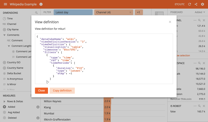
With this, Opbox developers that needed to integrate Turnilo with their applications could effortlessly explore the format of view definition payload by simply using Turnilo.
Another feature that had been frequently requested by our users was the possibility to compare current metrics with results observed a day, a week or a year ago. That is how the Time Shift feature was born. This feature is quite useful as normally users had to export the data for both periods, import them into Excel and create a chart there that presented differences. It was anything but efficient. With Time Shift in place users can observe the changes at a glance in Turnilo.
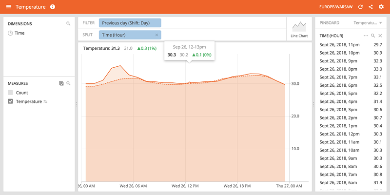
With Time Shift enabled, users can customize the time difference between compared periods by choosing one of the predefined periods or entering a custom period using ISO 8601 duration notation e.g. P2D or P4W. Both absolute and relative differences between values at data points are presented with visual cues regarding the direction of changes in form of icons and colors. There is, however, a quirk to this feature. Although for majority of measures value increase means positive change, e.g. number of visitors and amount of revenue there are some measures where increase is not positive at all, e.g. page load times or page rendering times. We plan to address this issue in one of the future updates.
Time Shift feature is the most significant one developed for our users since the inception of Turnilo but we are not going to rest on our laurels yet…
Plans for the future #
It is worth a mention that Turnilo being available as an open source software helped us a lot. Only 10 days after we released the initial version on GitHub, we already received some issues and nice discussion on how to make it even better. Then it was encouraging to find out that Turnilo had already been deployed at Wikimedia Foundation even though we did not seek visibility during the incubation phase of the project. Altogether it was a great way to bump up morale within our team.
Our roadmap for the nearest future consists of the following ideas:
- #184 Enhancing prominence of measures in Turnilo
with features like:
- usage of measures in filters which would be an equivalent of a “HAVING” clause in SQL
- user customizable formatters beside those predefined in configuration
- user defined percentile tuning for approximate histogram measures
- multiple measures drawn in one chart
- user defined measure derivations, e.g. difference between predefined measures
- #157 Making an interactive help system with tutorial so that data exploration becomes self-serviceable.
- #194 Changing the bar charts so that they support stacking and multiple splits.
- #169 Simplification of an internal model in order to allow more flexibility for future development.
- #49 Making it possible to hide side panels and look only at the data as a first step to mobile friendly UI.
- #32 Making the theme configurable so that every company could have its own look and feel.
- #68 Displaying Druid queries used to generate the view for the debugging purpose.
Please keep in mind that Turnilo is open source software and that you can be a part of it. Feel free to create issues or even better pull requests that align well with Turnilo’s manifesto. We have a public issue board on GitHub organized in milestones. We try hard to release a new Turnilo version every few weeks so do not forget to watch and star the project.
Together we can change the way people explore Big Data!