
Intuition Engineering at Allegro with Phobos
At Allegro, feature velocity is a top priority. We believe that one of our critical competitive advantages is the rate at which we introduce new features. In order to achieve a high feature velocity, one of the architectural choices that Allegro made a while back was to move to microservice architecture. So when somebody uses Allegro, a request comes in (and we just have a hypothetical example here) to service D — and we can imagine a service D being a proxy or an API layer — and whatever that service is, it is not going to have all the information it needs to serve a response. So the service D is going to reach out to service C and service F, and F in turn will reach out to A, and it will in turn reach out to B and E, and you see that this very quickly gets complicated. Allegro has somewhere around 500 microservices, so you can imagine how complicated the communication map looks.
Intuition Engineering #
One of the challenges our monitoring team faces is the need to get live feedback on hundreds of microservices in two datacenters, to get a gut feeling of whether the system as a whole is doing OK or not.
When you think monitoring, you think dashboards. And they are great for reactive monitoring — you’ve been alerted, go look at the dashboards, see what has changed. In fact, most standard data visualisations are not meant to be stared at in real time. They are useful for showing exact numbers and how they correlate to each other, and are meant to be more “something has happened, let’s go look, investigate, and figure what happened and when it started”. But we need to be able know what’s going on right now, to just take a quick glance and see that something could be going wrong.
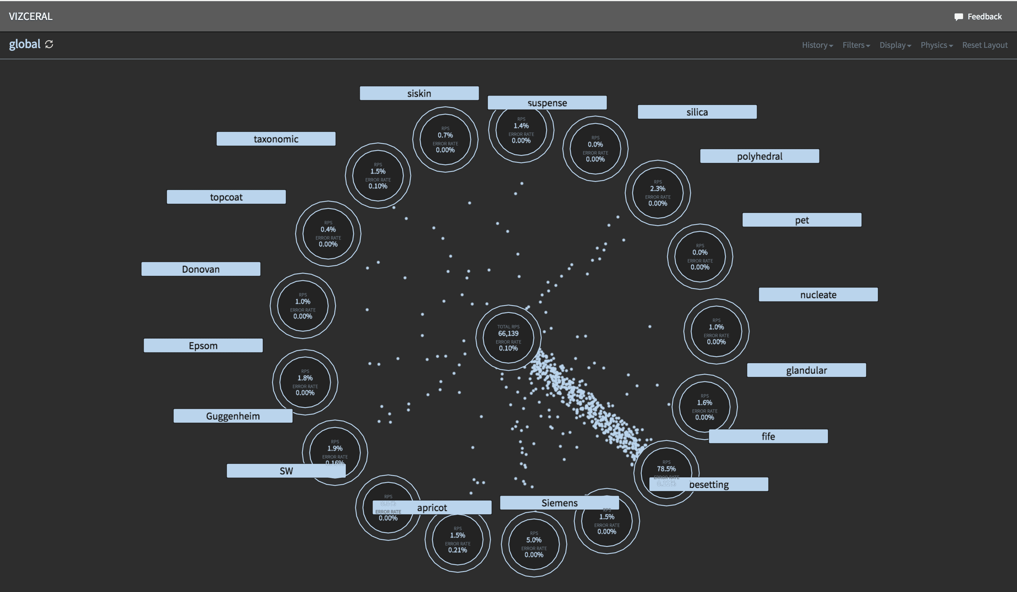
We are not the only ones facing this challenge. The approach of getting a gut feeling about the holistic state of the system was popularised by Netflix who called it “Intuition Engineering”. Netflix developed a tool called Vizceral to aid their traffic team in performing traffic failover between AWS availability zones.
Vizceral #
Let’s have a look at a video showing traffic failover simulation.
</div></div> At first, you see the normal state. The middle circle represents the Internet, showing how many requests are coming in per second and the error rate for that traffic. There are a lot of dots moving from the Internet to the surrounding circles, with each of those circles representing one of the AWS regions that Netflix uses. Traffic is handled by all three regions, and what’s nice about this view is that it’s fairly easy to tell the volume. You can see that US-East-1 is taking the most traffic, US-West-2 is next, and EU-West-1 is trailing closely behind.
Then you see that some errors start to happen in US-East-1. Dots that represent requests have colours, normal is light blue, because colour theory shows that blue is a calm neutral colour. Red dots mean there was a request that resulted in an error response, and yellow dots mean that there was a request that resulted in a degraded response (such as one of the rows missing in a list of movies).
So errors start to happen in US-East-1, and traffic team starts to scale up other 2 regions so that they can serve traffic of the users being affected in US-East-1. And soon they start to proxy some users from US-East-1 into the other two regions. More and more traffic is being proxied out of US-East-1, and when all the traffic is being proxied out of US-East-1, they can flip the DNS (which they can’t flip first because it would overwhelm the other two regions). So they flip DNS and the traffic which causes all traffic to be sent to the other two regions while engineers work on US-East-1 and get it back up. And as soon as US-East-1 is fixed they can do it all in reverse: flip DNS again, and slowly dial back the proxying until the system gets back to a steady state.
Look at just how intuitively clear this visualization tool is. Even without comments it is fairly obvious what was happening in the simulation — where errors happen, and where the traffic flows. This is very hard to achieve with a dashboard. And it’s exactly what Vizceral is good for.
Phobos #
Netflix opensourced the front end part of Vizceral, using which we created an internal tool called Phobos. It uses Vizceral, and yet it is quite different in many ways. First of all, we are not interested in traffic data, we are interested in how connections between microservices relate to specific business processes like login or purchase. If something goes wrong with a service A, the questions we’re interested in are: which other services might have degraded performance? And which business processes may be affected by it?
Instead of datacentres or availability zones, the main view of Phobos shows business areas. Each area contains microservices related to a specific business process. For example, one area could contain all microservices that handle user data, another one could contain all services that handle listings, and so on. You can zoom into an area to see individual services within this area and their connections. Services that belong to the area are shown in green, other areas are shown in blue. Phobos is integrated with our monitoring stack, so alerts are shown in red. For each service there is a summary panel where you have a list of hosts, incoming and outgoing connections, links to dashboards, PagerDuty, deploy info and other integrations. You can drill even further into an individual service to see individual instances of this service, their alerts and connections.
Phobos has the ability to travel back in time, so you can see what the state of the system was yesterday during an outage, which is especially useful during root cause analysis and postmortems.
To create a map of connections between services we use a combination of two sources. Firstly, we use trace IDs from Zipkin protocol. Secondly, we collect information about individual TCP connections from netstat. While the original Vizceral operates on data about the volume of requests, in Phobos we use data about the number of TCP connections established between hosts.
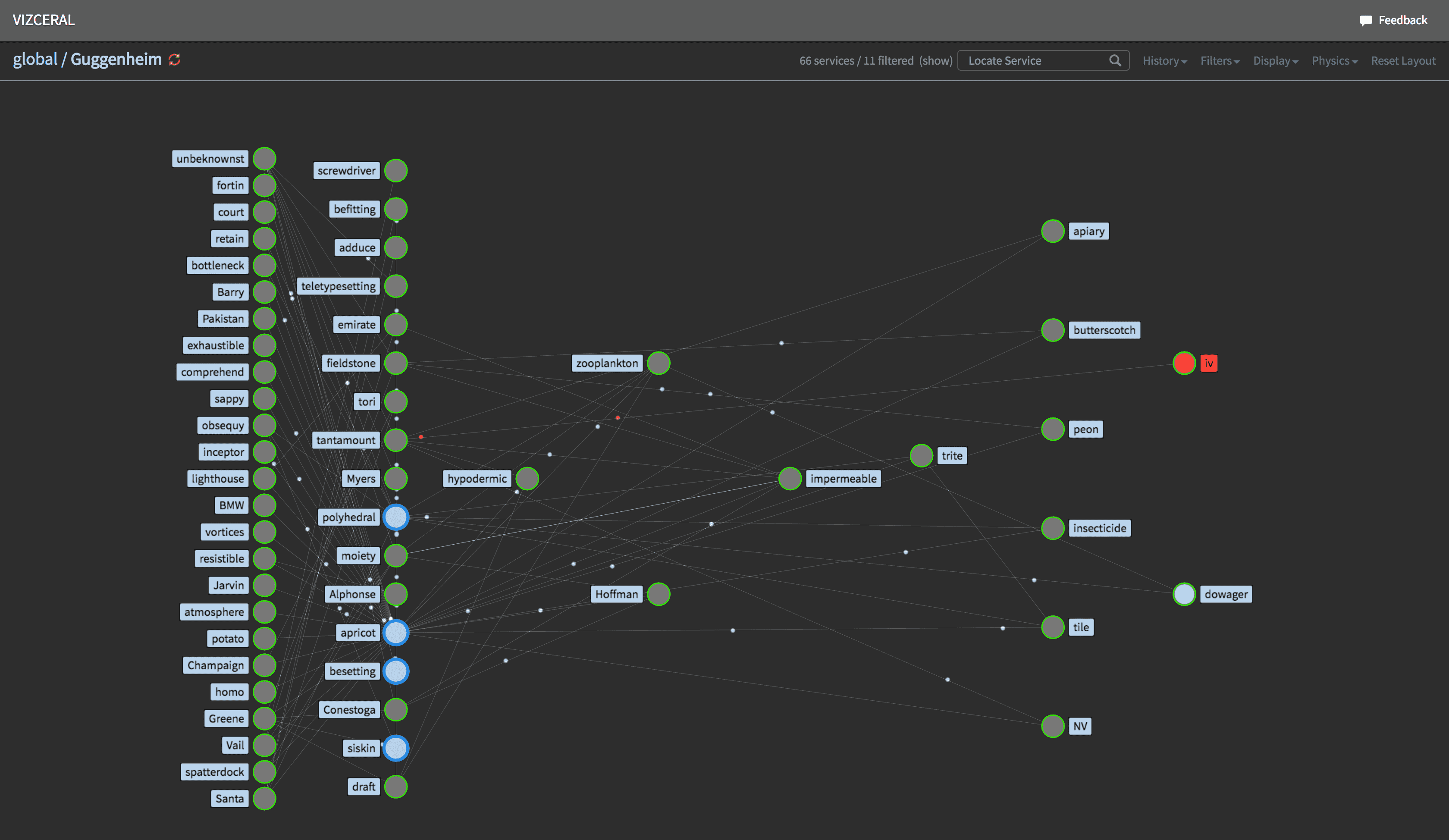
The frontend part of Vizceral, which is opesourced by Netflix, is written in WebGL with three.js library; and on top of Vizceral we use a Vizceral-React wrapper. The backend consists of three logical parts. First, there are host-runners — daemons that collect information about TCP connections between services and send this data via Apache Kafka to our Hadoop cluster. Second, there are Spark jobs that analyse connection data and store it in Cassandra database. And finally there is the Phobos backend itself, which is written in Python using Django Rest Framework. Phobos backend crunches the data from Cassandra and exposes it in JSON format via API endpoint in the form that Vizceral understands.
Phobos became an invaluable tool that gives us an interface to a very complex system, enabling us to develop an intuition about its state and health.